
You are using an out of date browser. It may not display this or other websites correctly.
You should upgrade or use an alternative browser.
You should upgrade or use an alternative browser.
New banner
- Thread starter Common-Sense Politics
- Start date
Kari
My name is Kari, and I am a Legion of One.
- Pronouns
- She/Her
Panoramic CityI'd rather get a nice, wide picture to make it look prettier. I'll keep looking.
Panoramic Buildings, River
*Corrects Potchen's link name
Panoramic Shite City

Me love the new banner
Panoramic Shite City
Me love the new banner
I also don't like the overlay of 'The land of peace, etc.' over the picture. :S
Also, I think the 'Republic of Europeia' would look better as just 'Europeia'.
I'm not sure about those pictures. I think I'd like something more city with just a few tall buildings in the middle...I'll look tomorrow.
Also, I think the 'Republic of Europeia' would look better as just 'Europeia'.
I'm not sure about those pictures. I think I'd like something more city with just a few tall buildings in the middle...I'll look tomorrow.
*agrees with Rachel*
Put the keyboard down Swak' and we'll get along juuuust fine
Put the keyboard down Swak' and we'll get along juuuust fine
Matthew Vinage
Banned
I third this.*agrees with Rachel*
Put the keyboard down Swak' and we'll get along juuuust fine
Elias Greyjoy
Decrepit Relic of the Past
I agree with Swak's first point. It's almost hard to read sitting on that reflection as is. It's needs either an outer glow or to be on a more solid color.
I prefer "Republic of Europeia" to just "Europeia". It is, after all, our state name, and the name of these forums.
I agree that the visibility of the motto needs some improvement. Perhaps a simple bold will do the trick. I may try it later.
I agree that the visibility of the motto needs some improvement. Perhaps a simple bold will do the trick. I may try it later.
Peaceful Llamas
New member
If you want a test forum, there's a forum from a defunct region (forum last posted on in 2008, region was annexed by the Axis of Evil and only has one puppet in it) that I have admin on and you can test stuff on.Sorry, I am experimenting. As we do not have a test forum, and I cannot take the time to setup one, I have to experiment live.
As I said in the past, I want to make something that is resize-able: no matter how much you stretch the forum, it will fill all of the width. The idea I have so far is to keep the "Republic of Europeia"+button+stars to the left fixated, and fill in the rest with a suitably-sized background image. I haven't found a good one yet, though.
If I haven't arrived at something decent by the end of my experimenting, I will revert to the original. Otherwise, I'll let it to the new one and wait for feedback.
Thanks for the offer PL. The difficulty in creating a test forum is not in registering one; but in transferring all of the Euro forum code base there. More precisely, it is not hard, just time consuming.
Peaceful Llamas
New member
True, true. Didn't think of that
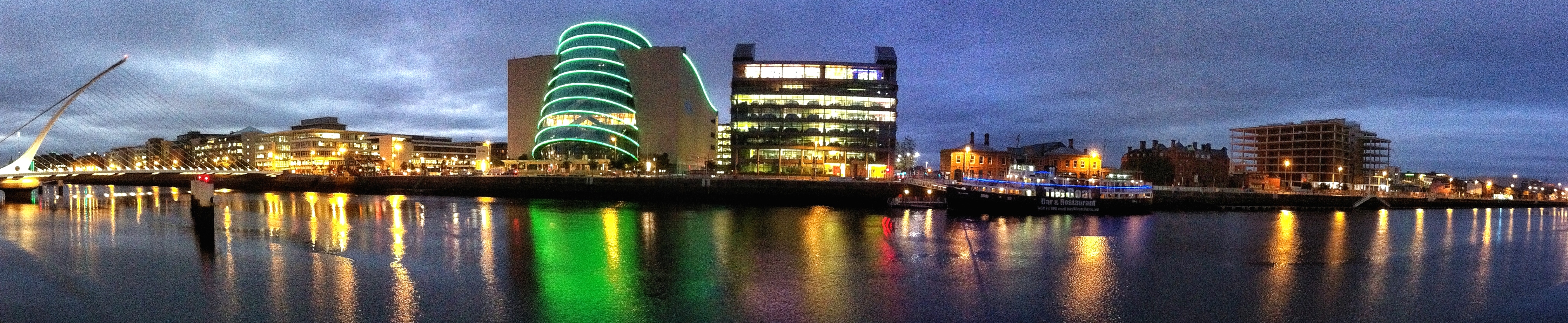
Yes, that one would be great dimension-wise. I would need to move the "Republic of Europeia" to the right, to be on top of the sky. It would also be harder to create the effect the current and previous banners used, where the sky is made the same blue hue as that used by the maintitle and forum buttons; but that may not be necessary for this image.
Another issue is that this image has a different architectural style than that used by the current banner ("modern" as opposed to "renaissance", and I am using the terms very vaguely as I am far from an expert in architecture). Would people be OK with this stylistic change?
Another issue is that this image has a different architectural style than that used by the current banner ("modern" as opposed to "renaissance", and I am using the terms very vaguely as I am far from an expert in architecture). Would people be OK with this stylistic change?
There is also the possibility for an all-blue banner. I have temporarily removed the background, so that people can see what it would look like and post comments here.
That second one looking stunning. Need to visit this place.
Personally I am not keen on an all-blue banner as it feels like we are missing something
Personally I am not keen on an all-blue banner as it feels like we are missing something